

I was tasked from TafeSA to re-brand a wine label in which I decided to re-brand d’Arenberg. The goal was to redesigned and modernised their logo but keep the heart and aspects of the history of the brand. To do this I investigated through primary and secondary sources. I began my research by visiting one of the biggest attractions to d’Arenberg winery, the cube. From there I was able to observe how the current owner, Chester Osborne, expressed his vision and passion through art. I was also able to talk to someone who worked in the cube about the history of d’Arenberg. From this insight it drove my passion to incorporate the extensive history of d’Arenberg and do it justice.
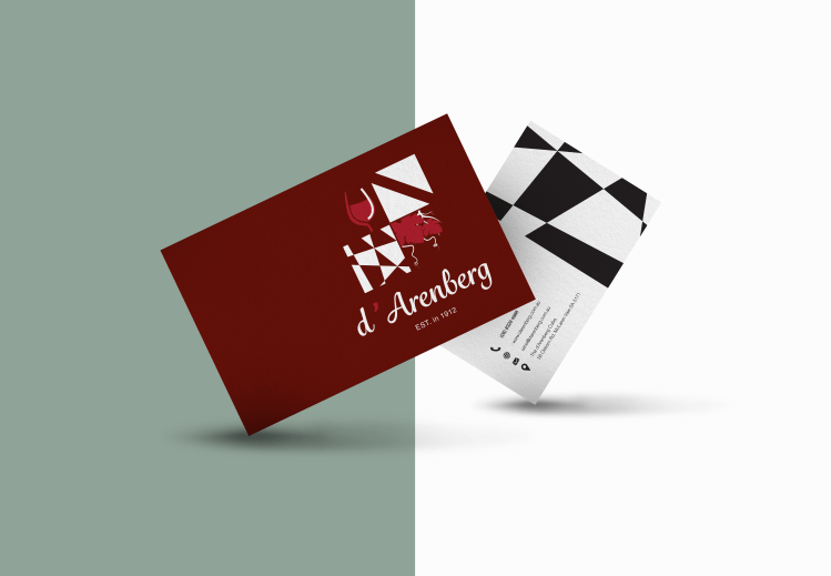
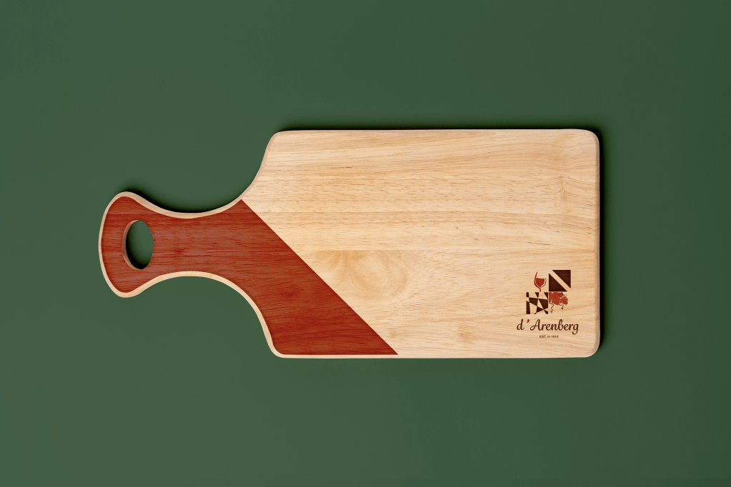
I revitalised the image and identity of d’Arenberg to advertise and modernise the brand. Particularly having a bigger focus on their tourist attraction called the cube, which inspired me to reflect the cube/grid format in the logo. The brand logo effectively conveys the intended creative direction of an elegant, modern, exciting and unique design. This is due to its composition, graphic elements and its cohesion of its history with a modern design. To further progress the brands identity I then applied the new logo to a billboard, charcuterie board, and a business card.
View more here My work
